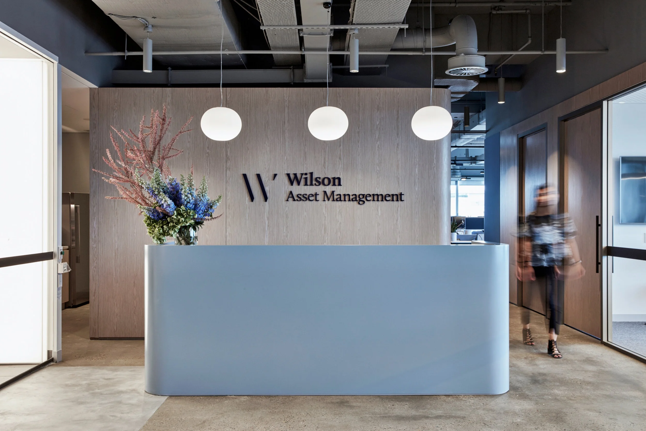
Wilson Asset Management
Photo by Toby Peet 2018
An aesthetic departure from the standard client experience; a space that invites Wilson Asset Management’s people and clients to a new ‘home’.
The interior design of the Wilson Asset Management (WAM) new workplace is an aesthetic departure from the typical office interior. The relocation to their new premises created an opportunity for WAM’s people and clients to be immersed in their distinct brand and culture. The design takes cues from hospitality and residential interiors to promote a sense of familiarity and create connection. This is a high-quality environment with dedicated health and wellbeing initiatives supported throughout the fit out.
A welcoming visitor experience is achieved through a warm, sophisticated design. The design exposes the building structure however this does not define the fitout. Natural textures, tones and colour have been used in a sophisticated way with a high level of detail. The palette is classic with a personalised overlay of artwork, planting and environmental graphics to communicate the brand and culture of WAM. Openness and transparency throughout the design are key: the reception entry area takes visitors seamlessly though to the work areas, with a stunning view of Sydney Harbour shared by staff and visitors alike.
Wellness is emphasised throughout the workplace and underpins the design. There are systems for air purification and water filtration installed that are well above premium grade building provisions. There are also integrated wellness initiatives including sleep and massage rooms to support the value placed on health and wellbeing at WAM. Overall, this is a workplace design that is geared towards an exceptional experience for everyone who inhabits the space.


